
AKIRA
I chose to use the cover of the North American version of the “AKIRA” manga series, Vol. 1, No. 16.
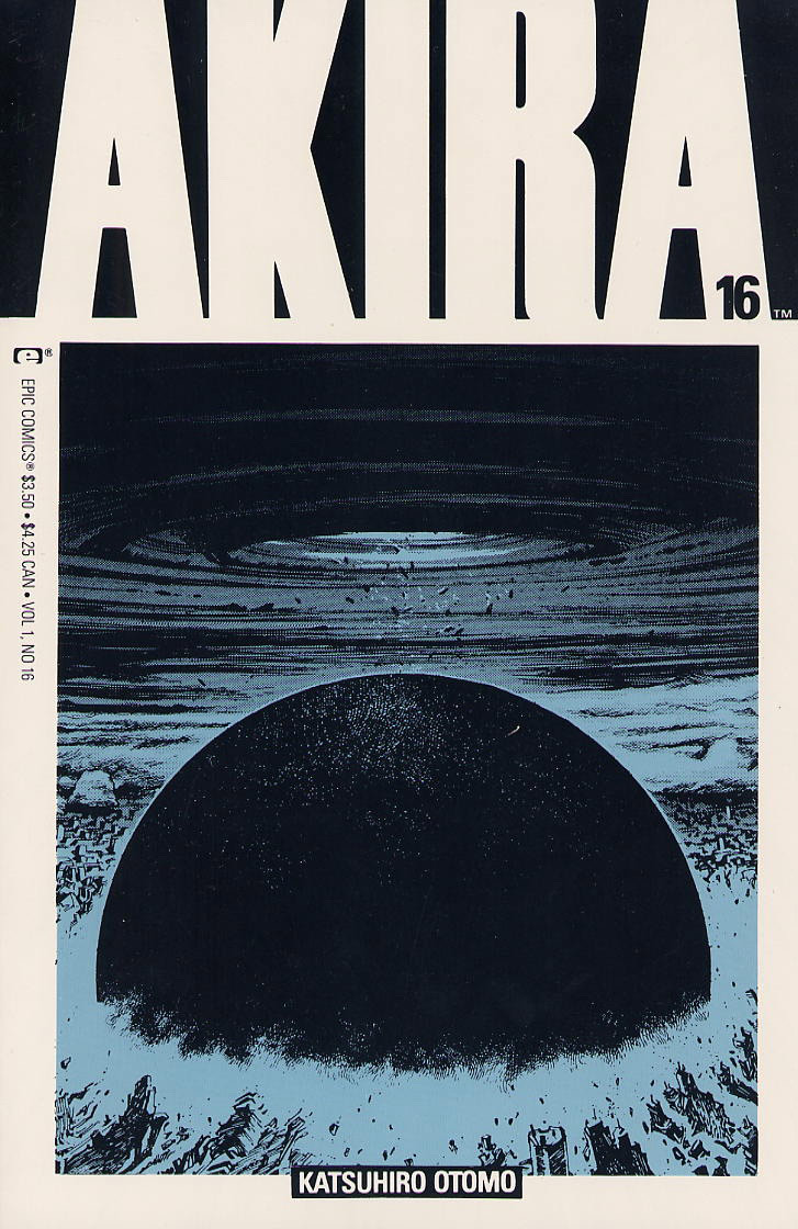
Admittedly, I have not read the manga. I have watched the film numerous times though, and I’ve always been captivated by its vibrant use of color and lighting, especially to help convey motiff and direction. I was originally going to analyze the original movie poster, but then I came across this manga cover.
The color and lighting played such an important role in the film, that it’s hard to imagine getting the same feeling from reading the manga, which was confined to black and white except for its color titles. Yet, this simple image really does manage to convey the same feeling that the film did, in a subtle and minimal way.
Looking at the grid we can see the image is mainly divided into two sections, with some minor variances. At the top we have the title section and below we have the main cover art, which is a depiction of an explosion in the middle of Neo-Tokyo. Since the title and the padding for the image are the same color, it provides a very seamless transition between the spaces. There are three minor variances to the form, the first being the clever use of negative space in the last ‘A’ of the title to convey the number of the manga in the series. Another variance is the author’s name, which creates negative space for itself beneath the main cover art. And finally, the comic distributor’s brand and pricings tucked into the left margin, at a 90º degree offset to everything. The balance between art and business. Overall, I would say this is a very effective use of the grid system, and manages to effective balance its asymmetries.
The color palette is very simple, using primarily white, dark blue/black, and a lighter blue. This color scheme creates another kind of form, where the information exists in this dark blue/black and white color space around the edges, while the art is centered using the light blue and dark blue/black scheme. The subtly of the colors and the details of the image strongly draw the eyes to the center of the page, yet the title’s use of negative space allows it to still remain highly visible. I was unable to figure out exactly what the font was, but it looks like some kind of modified version of Impact. My research here was inconclusive.