Color Palette
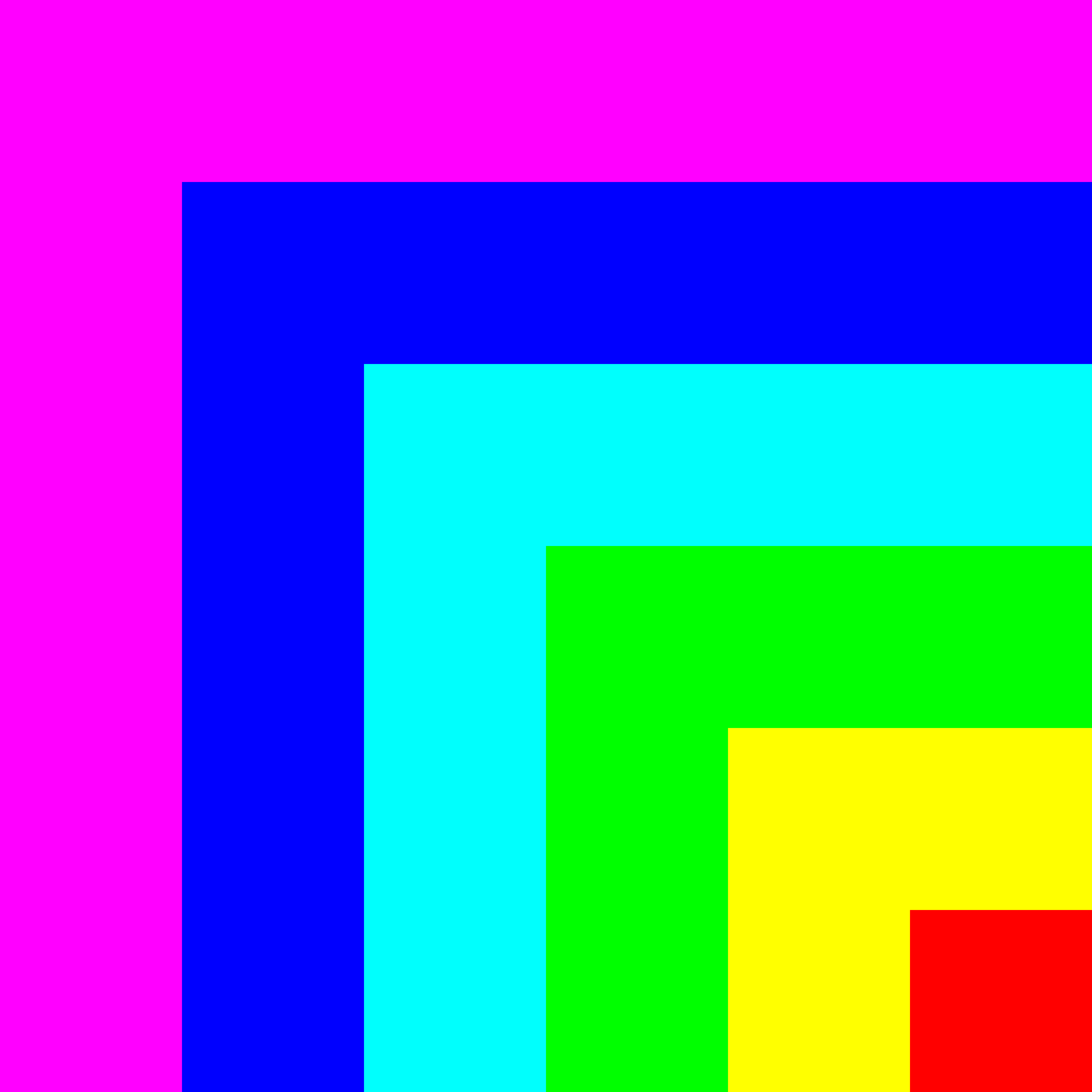
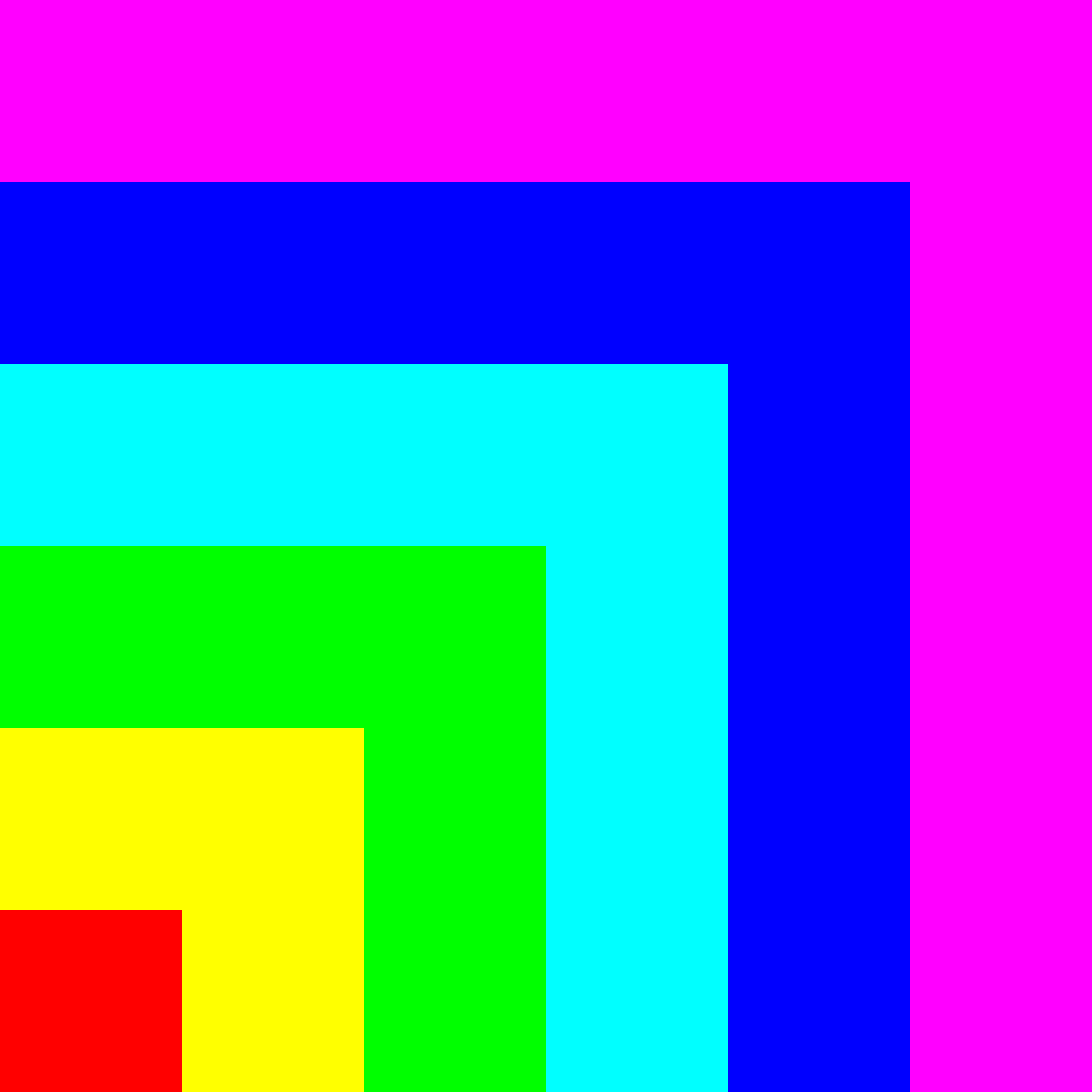
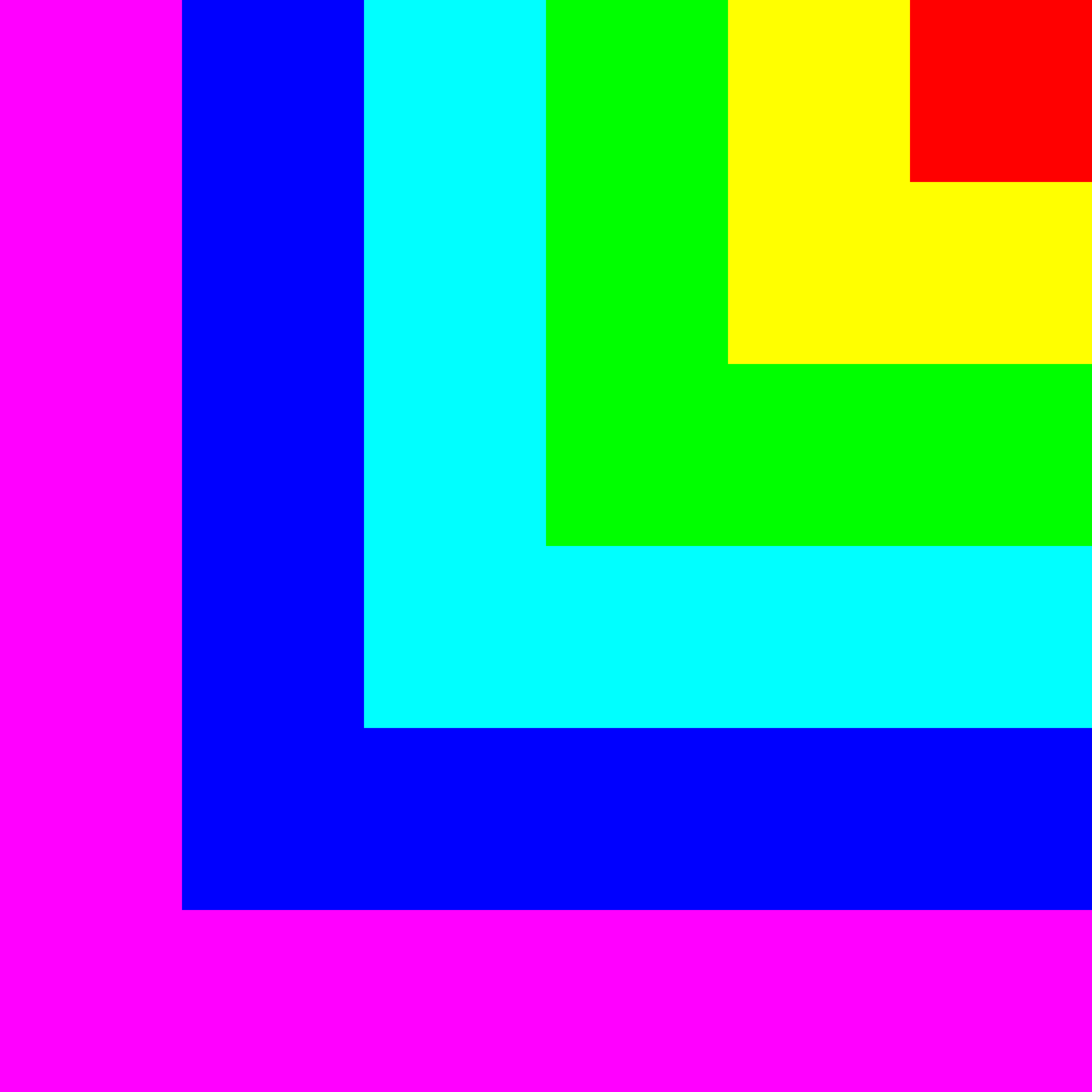
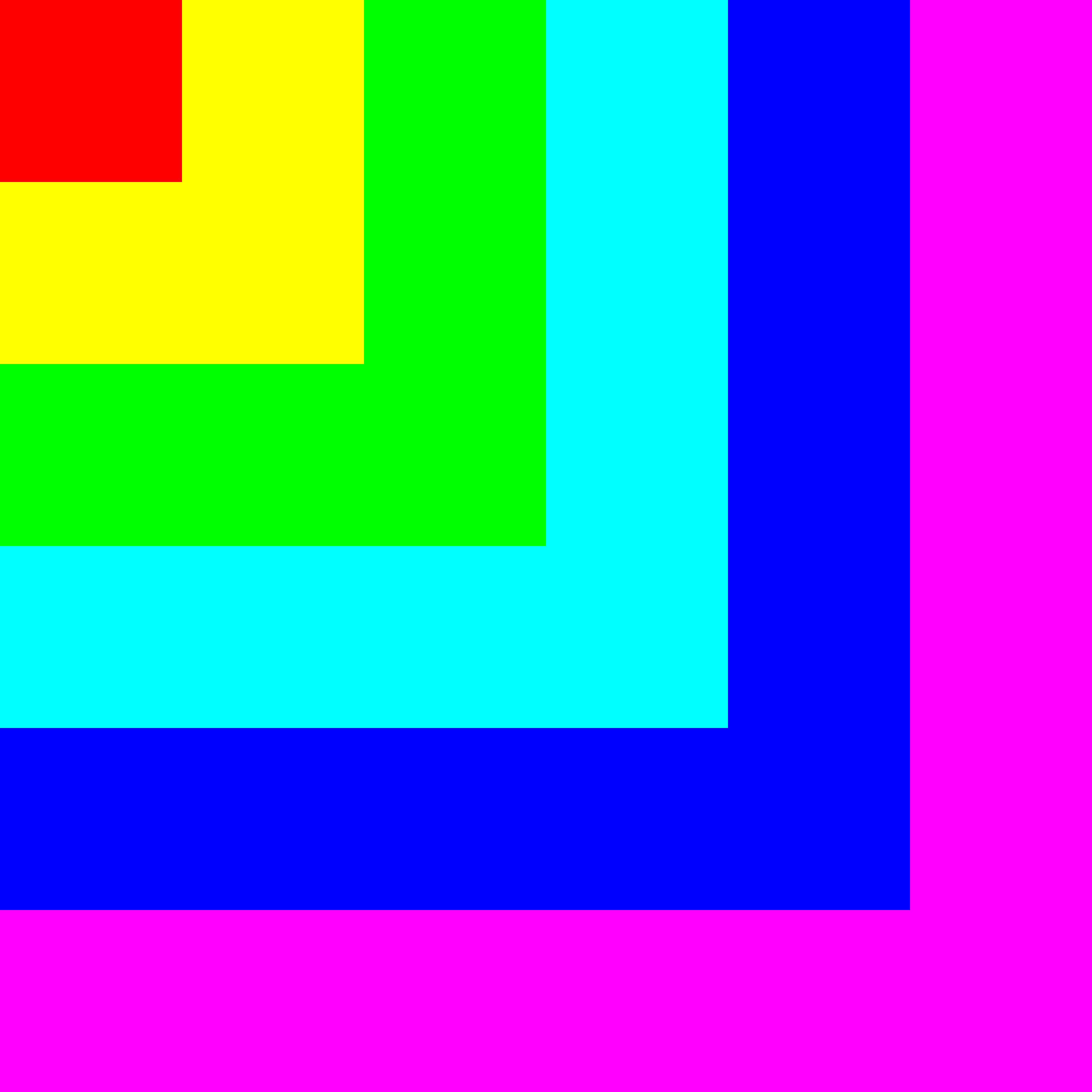
The format for this assignment was to create six square compositions that utilized the same color palette and to post it on Instagram. I went with a 6-tone color palette, using red, green, blue, cyan, magenta, and yellow. The color were arranged in the order they would appear in a wraparound spectrum, and the six compositions were designed to be viewed together in a 3x2 grid. Here are the six images below:
 |
 |
 |
 |
 |
 |
And here is a link to my actual Instagram page!
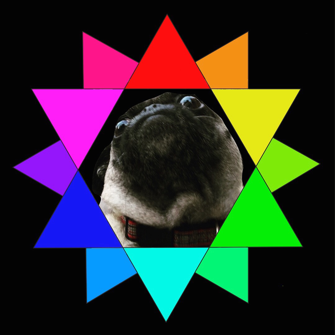
I’ve been doing a lot of lighting design for the past two years, and my go-to starting palettes are all built around the RGB and CMY color spaces. I like using these color models since they help conceptualize both additive and subtractive methods of color mixing, while also existing easy points to build gradients off of. It is also really easy to add points between them, and go to a 12-tone color palette, which is great for audiovisual works as you can map colors to the musical notes. I also really enjoy using simple geometry in my design, as I believe the simplest shapes are some of the most powerful. The colors themselves are representative of me because I enjoy incorporating and merging as many facets of my works as possible, so as to create a holistic and all-encompassing design.
Here is my current silly logo, which uses a 12-tone color palette based on the mixes of RGB and CMY. This is was made a while ago with Adobe Draw and GIMP, so excuse the rough edges. The dog is my friend’s pug; her name is Louie.