Signs
The first thing I noticed was that, once I started looking, the signs were everywhere. Equally surprising was that I had a harder time finding signs that I disliked than finding those I liked. Let’s start with the three signs that I liked:
 |
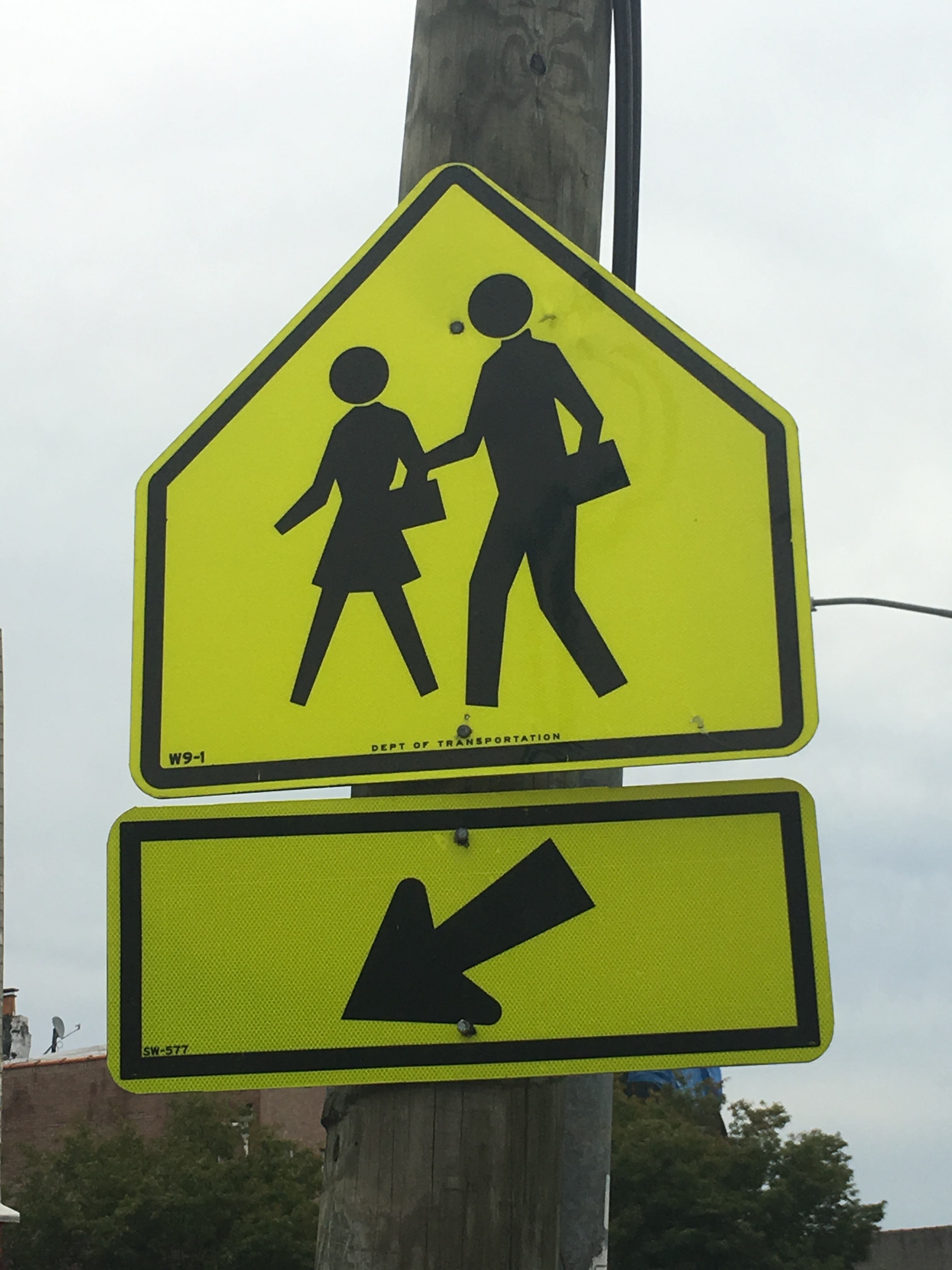 |
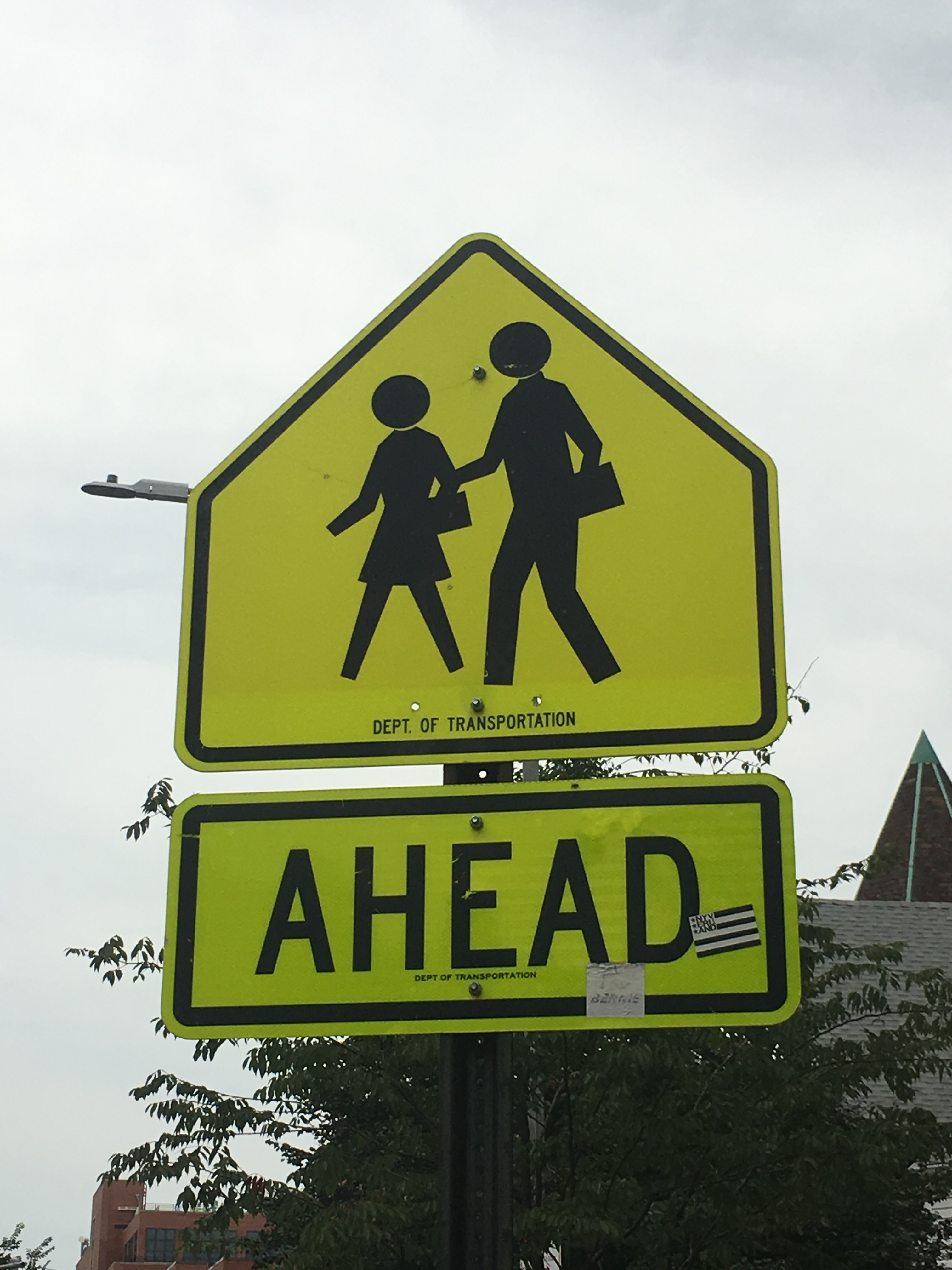
I considered these two signs a single modular sign. What I liked about it was that the top part of the sign remains the same and the bottom part is changed out depending on its usage. The main part of the sign is simple to understand and needs no words. The “AHEAD” part of the sign may not be ideal for someone who doesn’t speak the language, but the second part of the sign is usually within eyesight, and simply uses an arrow to denote the crossing is there. Since the top part of the sign is the same, it’s easy to make the visual connection, even if you couldn’t read the words.
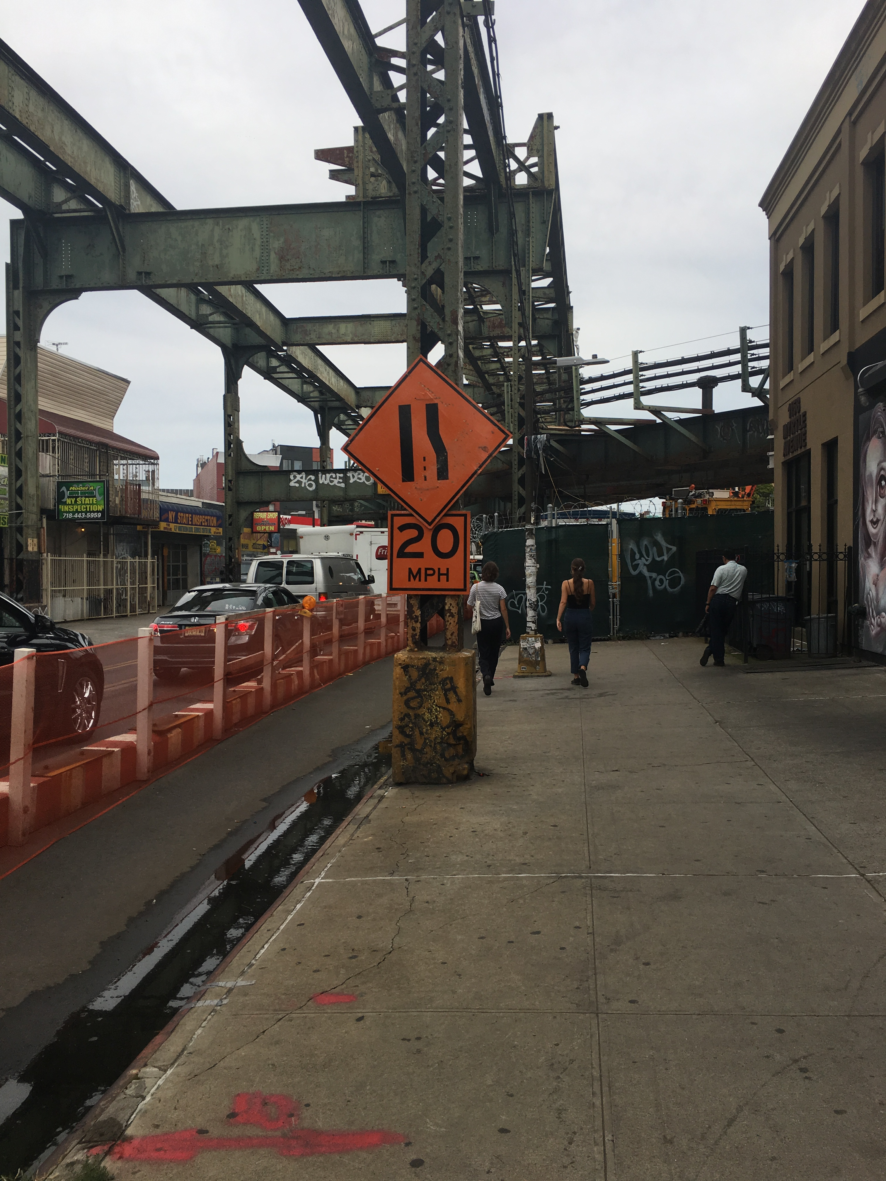
The other one that I liked was this “single lane ahead” sign above. The illustration is easy to understand, is informative in denoting that the right lane is closed, and the speed limit remains as a secondary modular sign so it can be adjusted in appropriate circumstances. Now let’s move on to the two signs that I thought could be improved.
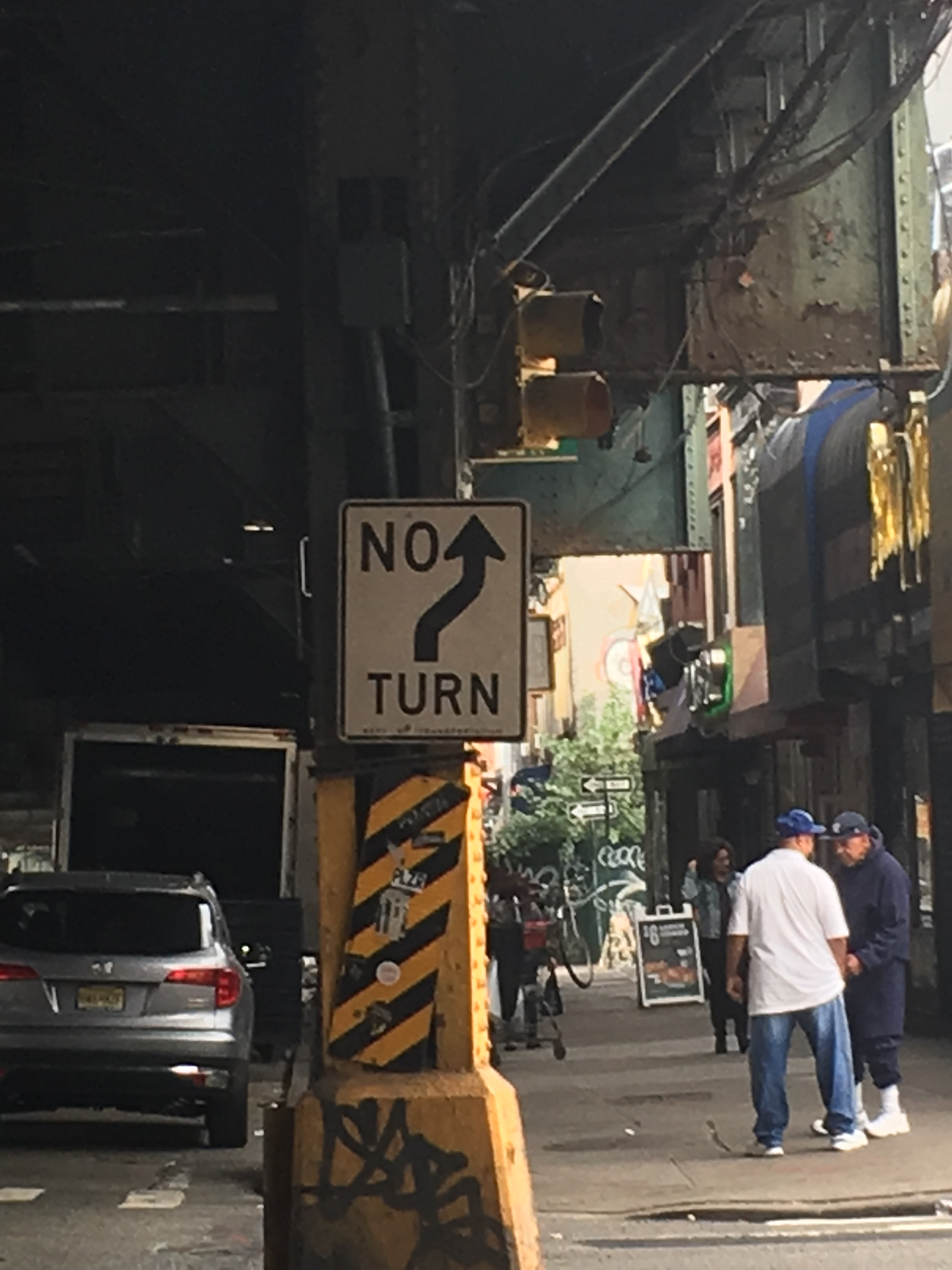
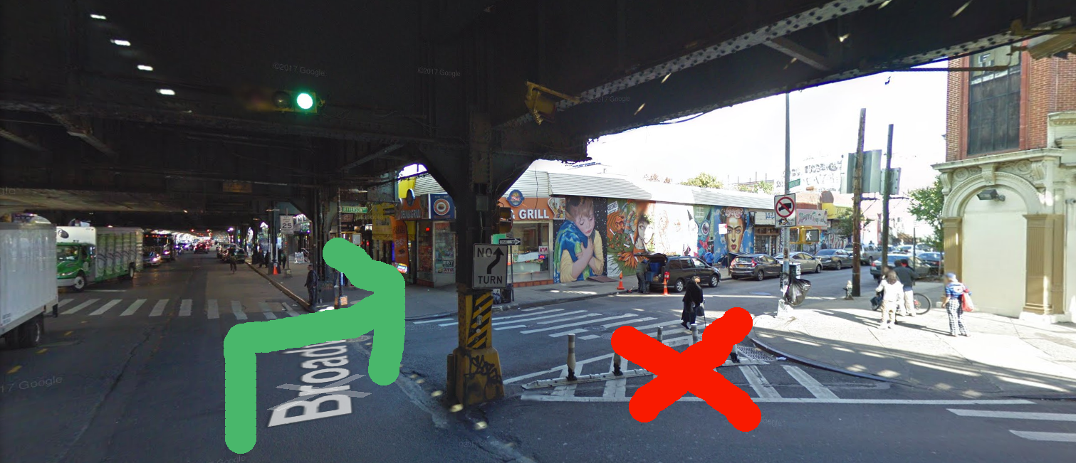
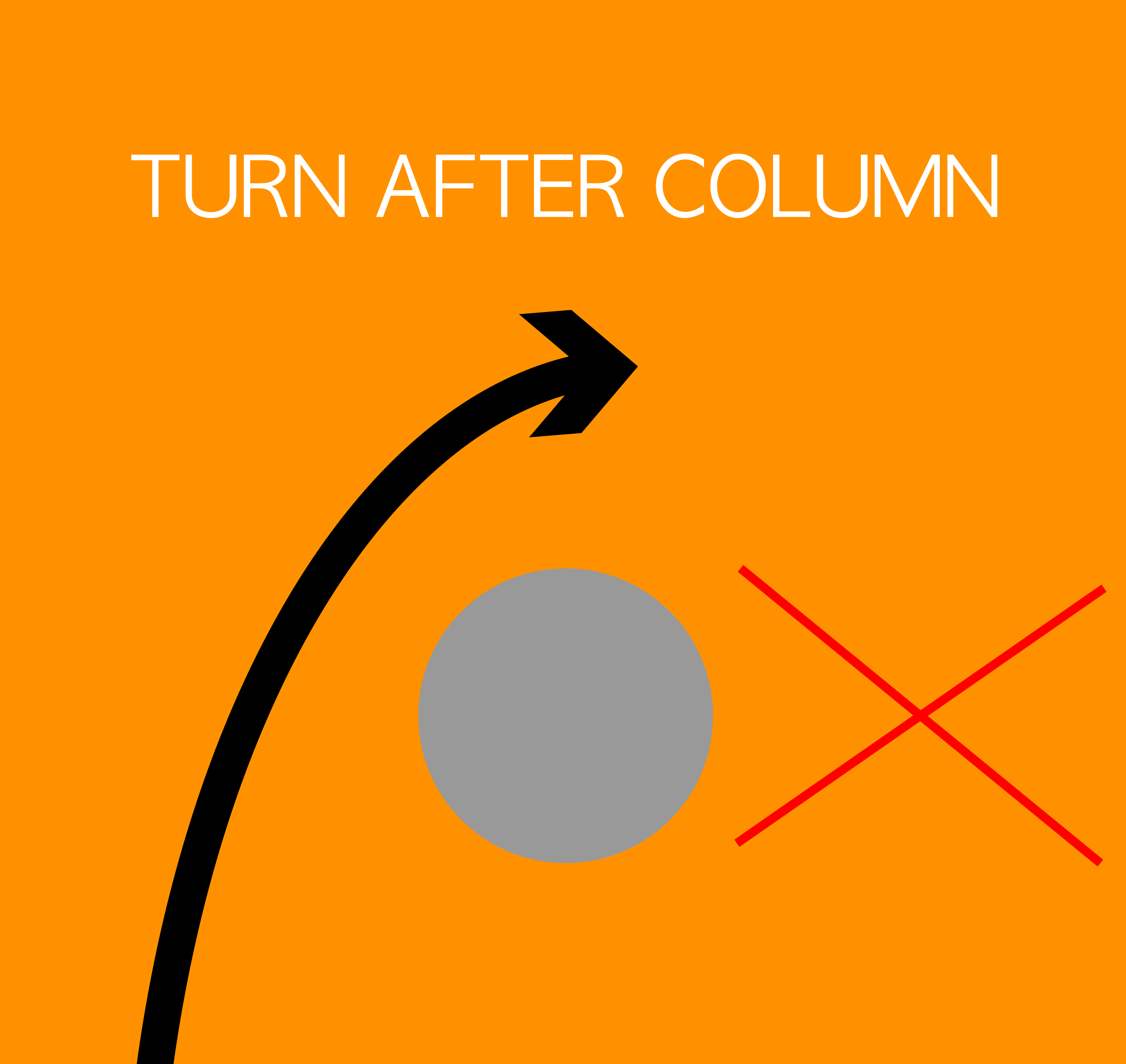
It was a bit tough to think of an improvement for this sign, because I wasn’t quite sure what it was trying to indicate (to its credit, this intersection is particularly confusing). What I eventually settled on was that it was trying to indicate that right turns should be taken after passing the column, to avoid anyone cutting between the column and the sidewalk. Please note that the cones in the below picture are new, leading me to believe this sign wasn’t doing its job properply. I had to grab this image from google maps as I didn’t frame it properly to show the cones. The first image shows what I think it is trying to convey, and the second image is my attempt at a better design.
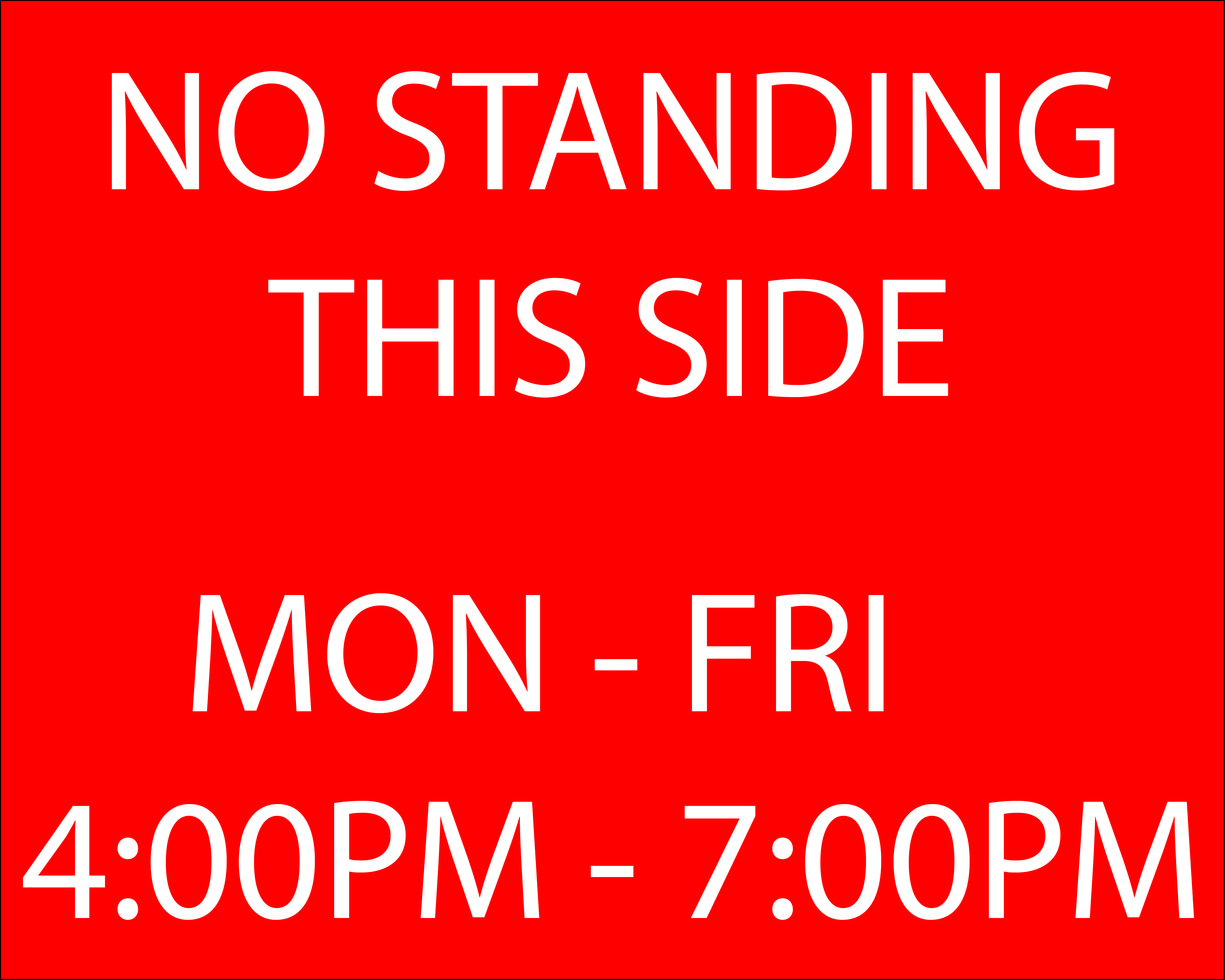
And lastly, the “No Standing” sign that lives right outside of my front door. I only have two qualms with this sign: one being that usage of dashes and “thru” interchangeably, and the second being the usage of the arrows.
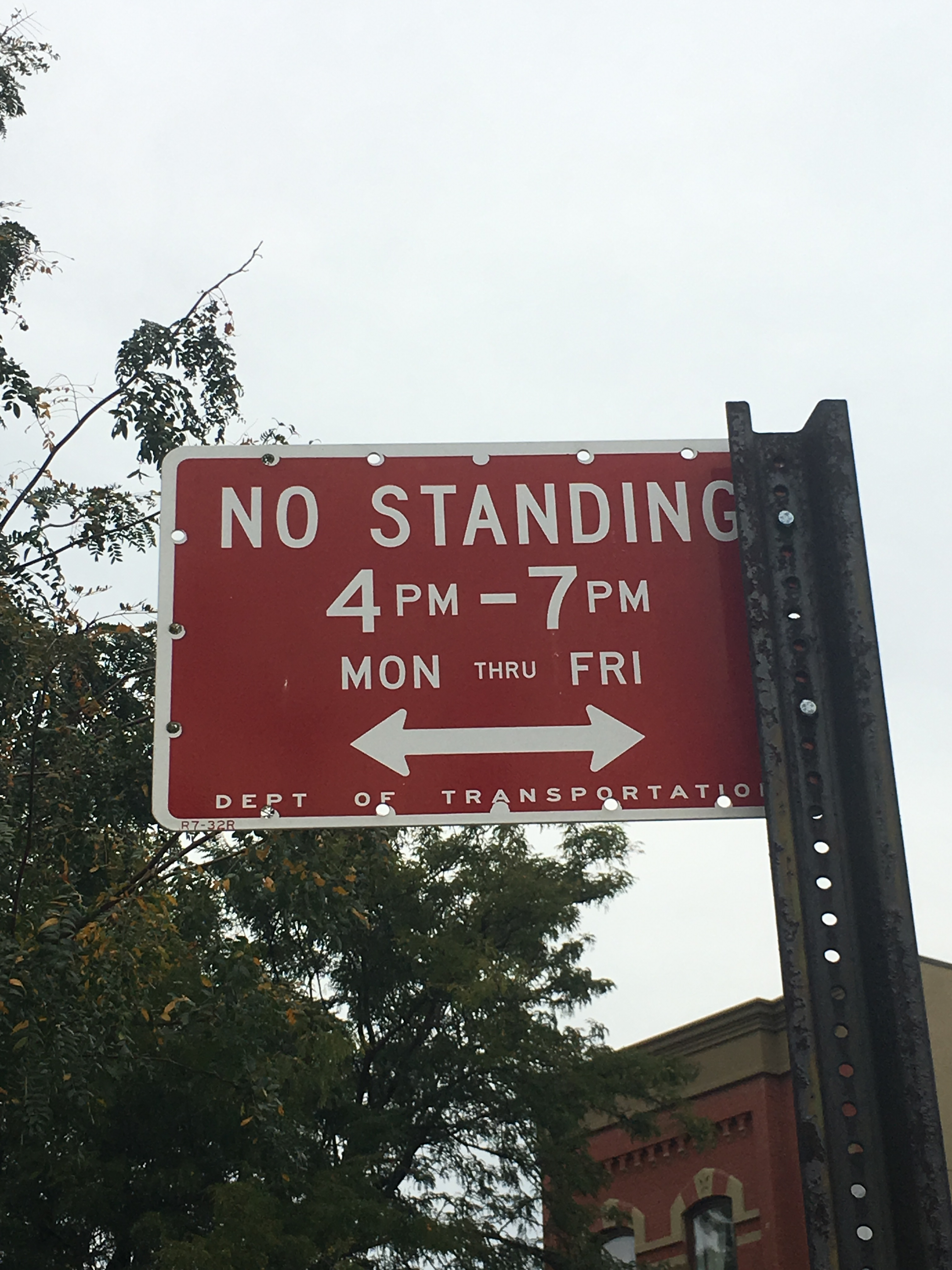
Since this sign applies to the whole side of the street, I thought it would be easier to have that in writing as opposed to people having to look for an additional sign as the second marker. Here is my idea for an improved version: