Subway Turnstile
I was having a hard time picking what piece of technology to survey for this project, so I thought about technologies that I interact with most often. I realized there was one piece of equipment that, not only did I interact with almost daily, but also have observed countless other’s interactions with it: the MTA MetroCard reader and turnstile.
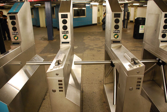
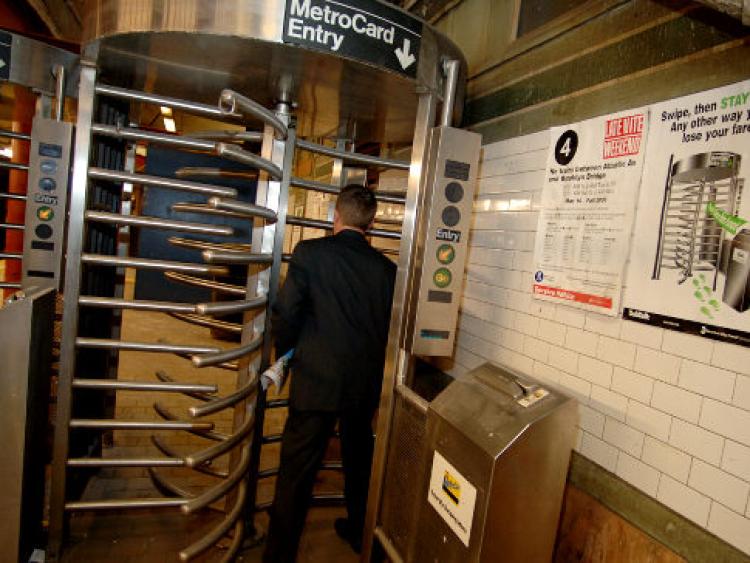
The card reader and turnstile act as a measure to ensure riders pay their fare for riding the subway and to relay information about the user’s MetroCard. The turnstiles also help keep track of the amount of riders. There are two types of turnstiles in use as far as I have observed: the horizontal turnstile and the vertical turnstile.


The interface seems fairly simple, swipe the card and walk through the turnstile, yet there are a number of issues I’ve witnessed with these designs over the past few years of my commutes. Since the reader mechanism is the same for both vertical and horizontal turnstiles, I’ll discuss the reader first and then the different turnstiles separately.
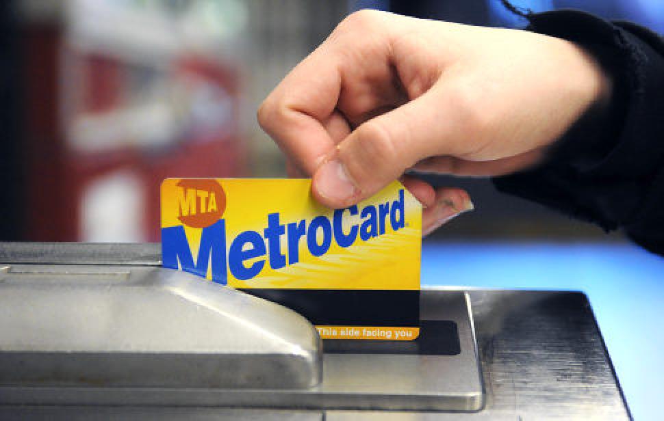
The MetroCards in use are magnetic, swipe-based cards and function very similarly to a credit card. However, these cards are paper thin and can be easily damaged or lost. This results in cards being disposed of more often than necessary, and users then have to spend time and money purchasing a new card.

The most common issue people have with this system is the orientation of the card. The readers themselves display very little information about how they are to be used, aside from the arrow that indicates the direction of the swipe. The MetroCard does have some very small text at the bottom of the card that reads “Insert this way / This side facing you” with arrows indicating the direction of the swipe. However the text is white on a dark yellow background, and as opposed to the very large, blue branding of the MTA’s own “MetroCard”, does not stand out well.
There is some tactile feedback on the card that indicates the correct position, one being the notch in the top right corner and the second being that the magnetic strip feels slightly thicker than the rest of the card. There is also some auditory feedback, but the tone for a correct swipe and an error are so alike that I find it hard to distinguish them.
In addition to worrying about the orientation of the card when swiping, the readers can often give errors for swiping too slow, too fast, or simply because the cards can get worn and damaged easily. So the action of swiping the card can stump new users and veteran straphangers alike, at least those of us who didn’t sleep too well last night. I’ll admit there were a few times where I was so tired I forgot to swipe altogether and walked straight into the locked turnstiles. Aside from this last issue, the problems with the swipe model of the reader could be solved by moving to tap-based electronic cards that do not need to be swiped, but are simply held near a scanner (they can also be scanned through a wallet or article of clothing, so you don’t even need to remove the card). A small, but not insigficant point about the current swipe-based cards is that people need to actually find the card and take it out of their storage comparment, and then swipe it correctly. I’ve noticed many people standing in front of the turnstile looking for their card and holding up traffic.
Now let us assume that the rider has swiped correctly and their fare has been accepted. You’d expect them to be in the clear, but now comes the turnstiles. There is really one main user interaction issue that I’ve witnessed, which is someone accidentally pushing their fare through. With the horizontal turnstile, this happens when someone uses their hand to push the turnstile instead of their body. If they are not in the currently open gap, they’ll lose their fare. The vertical turnstiles can steal your fare in a slightly trickier manner. If you accidentally walk to the wrong side of the vertical turnstile, and the proceed to walk the correct way without going back around the bars, you’ll also push your fare though. This results in people having to pay a second time or wait to swipe again if on an unlimited card.
Within the constraints of the current technology, I think the system works fairly well. However, upgrading to a newer tap-based electronic card system would provide a number of time and money-saving benefits. The most common issues I see people having are correctly swiping the card and also finding their card. If you are efficient and have your card out people approacing the turnstile, and swipe correctly the first time, the whole process takes less than 5 seconds. Someone looking for their card at the turnstile can take anywhere from 15 seconds to a minute. If the reader gives an error, some people will repeatedly try their card for longer that a minute before giving up to replace it or speaking to a teller, if available. The easiest part of the whole transaction is walking through the turnstile one the fare has been accepted, but even that action can result in people losing their fare if done incorrectly.