Ticket Redesign | Expressive Words
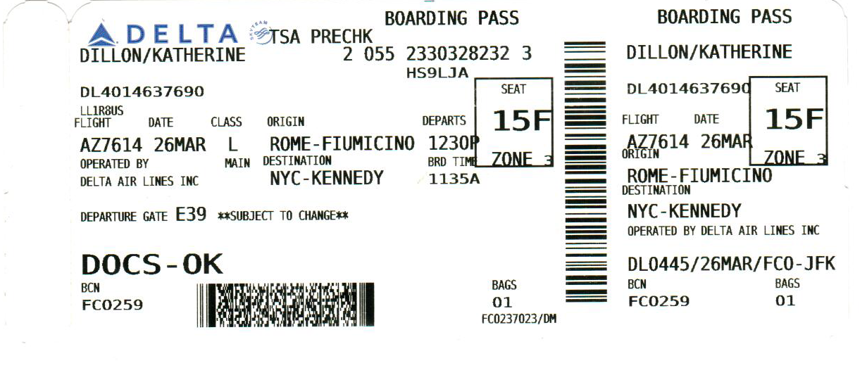
I decided to start with the ticket redesign just to get a bit more expierence with Illustrator before moving onto designing something from scratch. Seeing how clustered the existing ticket design is, it wasn’t that hard to at the very least make it a bit clearer. I organized the information so that it was more passenger-friendly, moving the information for official use towards the edges, while attempting to maintain a similar layout as the previous design. This was so that officials wouldn’t have to completely relearn where everything is, but nowadays I mostly see them scan the bar code. Rarely do the officials ever have to read your boarding pass, thus the precedence should be displaying the information clearly to the passenger!
Here is the original ticket:
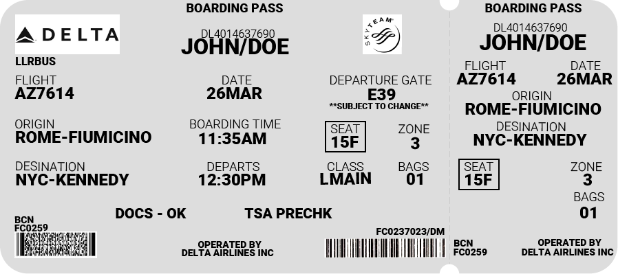
And here was my first design:
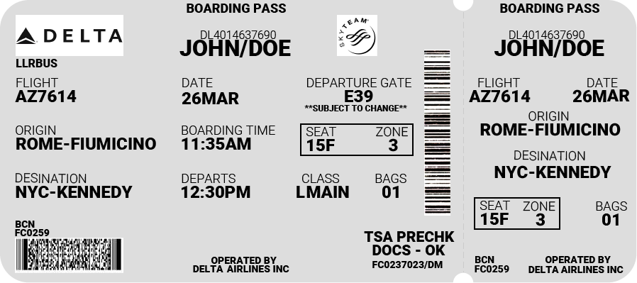
After giving it some thought, I realized that it would probably be best to maintain the original orientation of the second barcode, so that scanning the ticket would remain the same. I also added back the emphasis for the seat number and zone, in addition to making some minor position adjustments. I was happier with the second design, and thought it did a better of job of maintaining the original layout while making it substantially more legible.
I was having a bit of trouble using Illustrator, but these were the three designs I managed to come up with:
Spectrum
Arrow
![]()
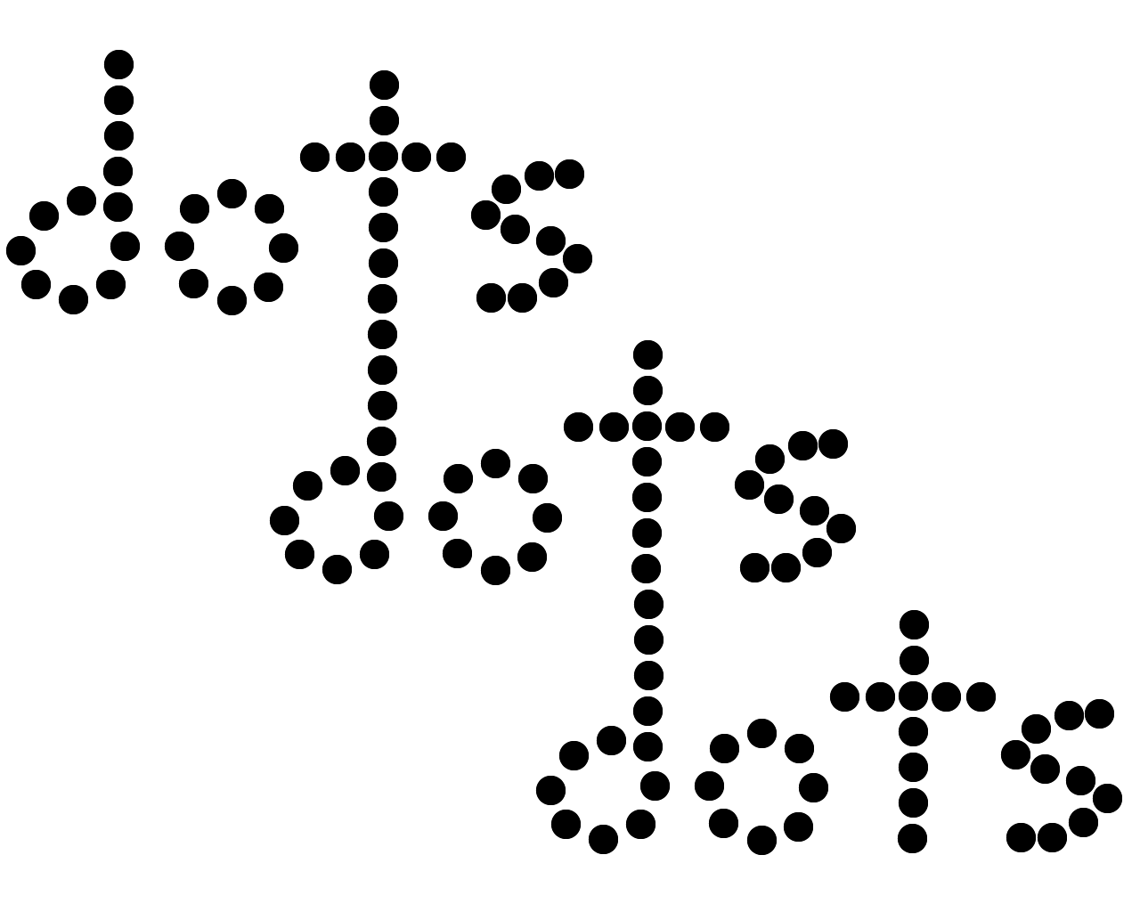
dots